Hierarchical Linear Modeling
Does clustering matter?
- You want to measure how students respond to a new type of active learning method (computer based) in math class
- You measure students math scores (DV) and the
proportion of time (IV) they spend using the computer
- You expect that the more time they spend doing the active learning method, the higher their math test scores will be
- You have access to different classrooms, but only
20 students per class (too small to publish)
- So you decide to treat all students like they are from the same classroom
- Lets go collect (simulate) our study.
Simulation
- Set the same slope per class, but set a different intercept per class. Create 4 linear regressions and merge them.
- Note: You would not “know” that the slopes were the same and the intercepts differed.
#Set seed so your answers are all the same
set.seed(9)
# Sample Per class room people
n1 <- 20; n2 <- 20; n3 <- 20; n4 <- 20
N<-n1+n2+n3+n4 # Total N
# Uniform distrobution of proportion of time per classroom
X1 <- runif(n1,  0, .35)
X2 <- runif(n2, .3, .55)
X3 <- runif(n3, .5, .75)
X4 <- runif(n4, .7,1.0)
# noise per classroom
e1 <- rnorm(n1, 0, sd=2.5)
e2 <- rnorm(n2, 0, sd=2.5)
e3 <- rnorm(n3, 0, sd=2.5)
e4 <- rnorm(n4, 0, sd=2.5)
# Intercepts per classroom
B0.1 <- 80
B0.2 <- 70
B0.3 <- 60
B0.4 <- 50
# Same slope per classroom
B1=10
# Our equation to  create Y for each classroom
Y1 = B1*scale(X1,scale=F)  + B0.1 + e1
Y2 = B1*scale(X2,scale=F)  + B0.2 + e2
Y3 = B1*scale(X3,scale=F)  + B0.3 + e3
Y4 = B1*scale(X4,scale=F)  + B0.4 + e4
# Merge classrooms into 1 data.frame
Math.Data<-data.frame(Math=c(Y1,Y2,Y3,Y4),ActiveTime=c(X1,X2,X3,X4),
                      Classroom=c(rep("C1",n1),rep("C2",n2),rep("C3",n3),rep("C4",n4)),
                      StudentID=as.factor(1:N))
Step 1: Plot our results
- We will ignore classroom and simply plot the results
- Note: *ggplot2 lets us plot the results
with a regression line automatically added
- ggplot2 works by adding “layers” to our data
- Note: *ggplot2 lets us plot the results
with a regression line automatically added
library(ggplot2)
theme_set(theme_bw())
ClassRoom.Plot.1 <-ggplot(data = Math.Data,
                          aes(x = ActiveTime, y=Math))+ #scaffold
  geom_point()+ # add layer of scatterplot
  geom_smooth(method = "lm", se = TRUE)+ # add regression line
  xlab("Proportion of Time Engaged in Active Learning")+
  ylab("Math Score") # add labels
ClassRoom.Plot.1 #call plot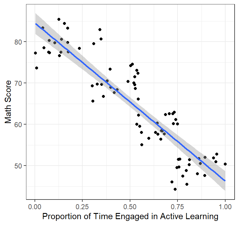
Step 2: Run Regression
- We will run the regression across all classrooms
library(stargazer)
Class.All<-lm(Math~ActiveTime, data = Math.Data)
stargazer(Class.All,type="latex",
          intercept.bottom = FALSE, single.row=TRUE,
          star.cutoffs=c(.05,.01,.001), notes.append = FALSE,
header=FALSE)- Results show that a high intercept = 84.52 and a strong negative slope = -38.23 and a very high \(R^2\) = 0.8
- You expected a positive slope, but the graph shows a negative one (and so clearly at that!)
- With your massive \(R^2\) and
counterintuitively strong negative slope you rush to publish in
Psych Science and report, “Active learning is a flop!
Dont waste your class time!”
- Impact: Every math teacher in America changes their teaching, and the next generation of math students score worse than the last generation of student. You ruined America’s future. Good job!
- What went wrong? Your \(R^2\) and slope were so huge you could not be possible wrong?!
What is Random?
- Each kid add noise (is a random effect)
- But are all the kids from all the classroom adding independent
noise?
- No! Students are not independent of each of other within the
classroom
- Error could be systematic (e.g., class clowns, class moral, room temp, time of day for the class) or unsystematic error, but that error that is unrelated to your main question
- No! Students are not independent of each of other within the
classroom
- Each classroom is, therefore a “cluster” where the kids scores are
inter-related based their shared experience
- The kids are nested in the classroom!
- Another way to think about it: The kids are repeated measures of their classroom
- The kids are nested in the classroom!
Re-examine by Cluster
- Hierarchical designs: Students nested in classrooms [Clustered data] with student-level predictors Level 1
ClassRoom.Plot.2 <-ggplot(data = Math.Data,
                          aes(x = ActiveTime, y=Math))+
  geom_point(aes(colour = Classroom, shape=Classroom))+ # we add color by cluster
  geom_smooth(method = "lm", se = TRUE)+
  xlab("Proportion of Time Engaged in Active Learning")+
  ylab("Math Score")+ # add labels
  theme(legend.position = "top")
ClassRoom.Plot.2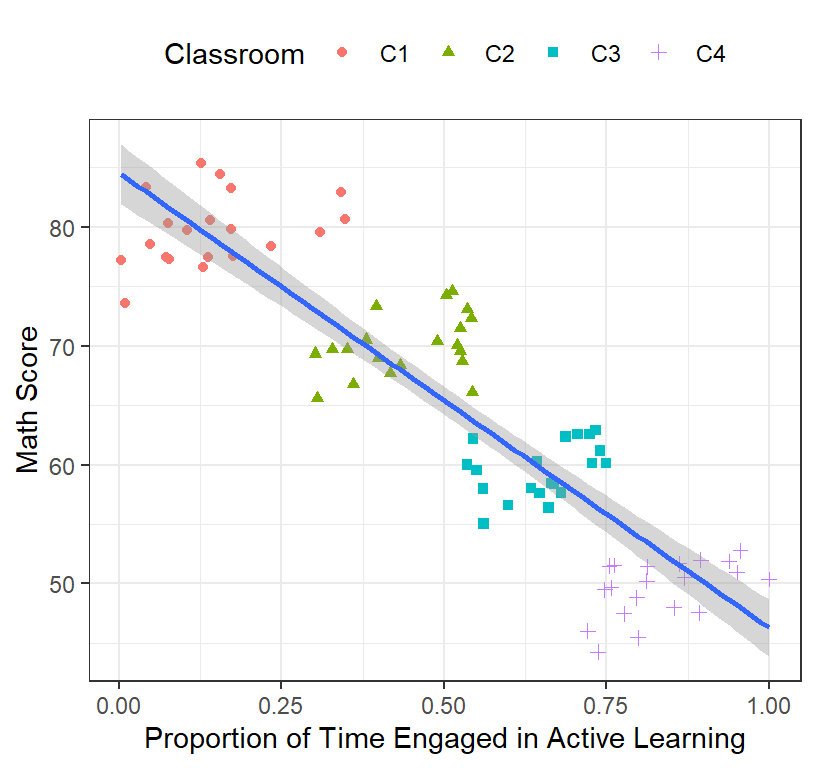
- Clearly there are difference between classrooms (Note: real data is never this well clustered)
- One solution that was used (back before mixed models) was to run the regression for each cluster
ClassRoom.Plot <-ggplot(data = Math.Data,
                        aes(x = ActiveTime, y=Math))+
  geom_point(aes(colour = Classroom, shape=Classroom))+
  geom_smooth(method = "lm", se = TRUE, aes(group = Classroom))+# we add group level
  xlab("Proportion of Time Engaged in Active Learning")+ylab("Math Score")+ # add labels
  theme(legend.position = "top")
ClassRoom.Plot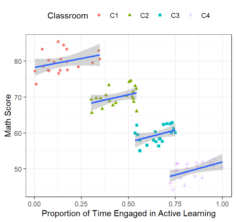
- The slopes look positive now! Lets run our regression for each classroom and check
Class1<-lm(Math~ActiveTime, data = subset(Math.Data,Classroom=="C1"))
Class2<-lm(Math~ActiveTime, data = subset(Math.Data,Classroom=="C2"))
Class3<-lm(Math~ActiveTime, data = subset(Math.Data,Classroom=="C3"))
Class4<-lm(Math~ActiveTime, data = subset(Math.Data,Classroom=="C4"))

stargazer(Class1,Class2,Class3,Class4,type="latex",
          intercept.bottom = FALSE, single.row=TRUE,
          star.cutoffs=c(.05,.01,.001), notes.append = FALSE,
header=FALSE)- Our intercepts are clearly different across classrooms
- Our slopes are all around 10 (simulation lets them vary randomly),
but in only one case is it significant
- Why so few significant resulty; Only 1/4 classroom? That does not
look very supportive our theory!
- With so few kids per classroom, our result was really underpowered
- What to do now?
- Why so few significant resulty; Only 1/4 classroom? That does not
look very supportive our theory!
Old School Approach 1
- Extract the intercepts and slopes from each model and test if these 4 are difference from zero (Note: this makes more sense when you have 30 classroom)
- One sample t-test (against 0)
- R code note: we have to unname the coef from each from each model because the word intercept/slope might follow the numbers and we want to remove that for further analysis (i.e., strip the attribute)
intercepts.Math.Data<-unname(c(Class1$coef[1],Class2$coef[1],
                               Class3$coef[1],Class4$coef[1]))
M.Intercept<-mean(intercepts.Math.Data)
SD.Intercept<-sd(intercepts.Math.Data)
library(apa)
t.intercept.Math.Data<-t_apa(t.test(intercepts.Math.Data), print=FALSE)- The intercept mean = 57.87 with a SD = 17.58, and the one sample t-test, t(3) = 6.58, p = .007, d = 3.29
Slope.Math.Data<-unname(c(Class1$coef[2],Class2$coef[2],
                          Class3$coef[2],Class4$coef[2]))
M.Slope<-mean(Slope.Math.Data)
SD.Slopet<-sd(Slope.Math.Data)
t.Slope.Math.Data<-t_apa(t.test(Slope.Math.Data), print=FALSE)
The slope mean = 12.34 with a SD = 1.97, and the one sample t-test, t(3) = 12.51, p = .001, d = 6.25
\(R^2\) is alittle harder as you cannot simply take a mean and SD of the r values. You must do a Fisher’s r’-to-z \[ r.to.z' = \frac{1}{2}[log_e(1+r) - log_e(1-r)] = archtanh(r) \] and back again
\[ z'.to.r = tanh(z') \]
#Functions for fishers transforms
FisherRtoZ <-function(r) {.5*((log(1+r)-log(1-r)))}
FisherZtoR <-function(z) {tanh(z)}

R2.Math.Data<-FisherRtoZ(c(summary(Class1)$r.squared^.5,summary(Class2)$r.squared^.5,
                           summary(Class3)$r.squared^.5,summary(Class4)$r.squared^.5))
M.R2<-FisherZtoR(mean(R2.Math.Data))^2
SD.R2<-FisherZtoR(sd(R2.Math.Data))^2
t.R2.Math.Data<-t_apa(t.test(R2.Math.Data), print=FALSE)- The \(R^2\) mean = 0.17 with a SD = 0.01, and the one sample t-test, t(3) = 10.74, p = .002, d = 5.37
In all cases the \(R^2\), slope, and intercept were significantly different from zero, but is this analysis make sense? What have we lost? Well, we lost the SE from regression models. This is an anti-conservative approach (you dumped all the variance from the regressions)
Old School Approach 2
- Since the intercepts differ, why can’t we just center the DV relative to each classroom?
- Lets see what happens
- Note: to make this happen in R, we will use the plyr package and mutate the data on the fly. This will add a new column to the data frame with the mean Math Score per class room. Then we can subtract the Math Score of each kid from the mean Math Score
### Rescale DV
library(plyr)
# Create a new variable in the data which is the mean of Math Score per class room (at each subject)
Math.Data<-ddply(Math.Data,.(Classroom), mutate, ClassMeanMath = mean(Math))
# next we center relative to each student relative to their class Math mean (how much to they differ from their cohort)
Math.Data$Math.Class.Centered<-Math.Data$Math-Math.Data$ClassMeanMath- Plot of the centered Math Scores
ClassRoom.Plot.3 <-ggplot(data = Math.Data, aes(x = ActiveTime, y=Math.Class.Centered))+
  geom_point(aes(colour = Classroom, shape=Classroom))+
  geom_smooth(method = "lm", se = TRUE)+# we add group level
  xlab("Proportion of Time Engaged in Active Learning")+
  ylab("Math Score (Classroom Centered)")+
  theme(legend.position = "top")
ClassRoom.Plot.3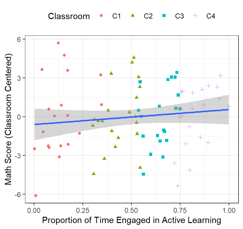
- We will re-run the regression across all classrooms on the centered scores
Class.All.C<-lm(Math.Class.Centered~ActiveTime, data = Math.Data)
stargazer(Class.All.C,type="latex",
          intercept.bottom = FALSE, single.row=TRUE,
          star.cutoffs=c(.05,.01,.001), notes.append = FALSE,
header=FALSE)- That also did not make any sense! Why? Look here
ClassRoom.Plot.4 <-ggplot(data = Math.Data,
                          aes(x = ActiveTime, y=Math.Class.Centered))+
  geom_point(aes(colour = Classroom, shape=Classroom))+
  geom_smooth(method = "lm", se = TRUE)+# we add group level
  geom_smooth(method = "lm", se = TRUE, aes(group = Classroom, color=Classroom))+
  xlab("Proportion of Time Engaged in Active Learning")+
  ylab("Math Score (Classroom Centered)")+ # add labels
  theme(legend.position = "top")
ClassRoom.Plot.4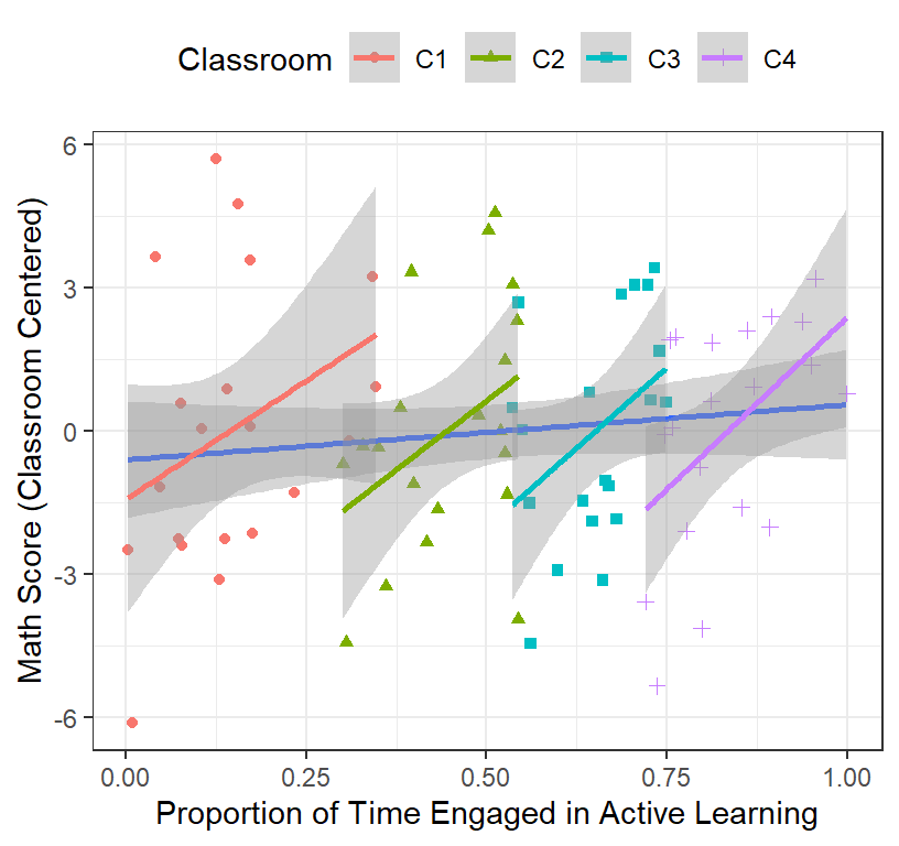
- The problem is the range of time is different from each classroom.
- We can try to recenter that as well
### Rescale IV
Math.Data<-ddply(Math.Data,.(Classroom), mutate, ClassActiveTime = mean(ActiveTime))
Math.Data$ActiveTime.Class.Centered<-Math.Data$ActiveTime-Math.Data$ClassActiveTime- Plot of the centered Math Scores and Active Time
ClassRoom.Plot.5 <-ggplot(data = Math.Data,
                          aes(x = ActiveTime.Class.Centered, y=Math.Class.Centered))+
  geom_point(aes(colour = Classroom, shape=Classroom))+
  geom_smooth(method = "lm", se = TRUE)+# we add group level
  xlab("Proportion of Time Engaged in Active Learning\n(Centered per Classroom)")+
  ylab("Math Score (Classroom Centered")+ # add labels
  theme(legend.position = "top")
ClassRoom.Plot.5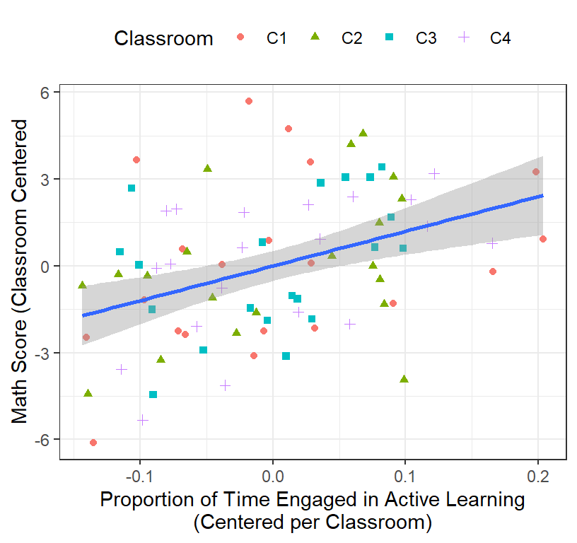
- Regression results
Class.All.C2<-lm(Math.Class.Centered~ActiveTime.Class.Centered, data = Math.Data)
stargazer(Class.All.C2,type="latex",
          intercept.bottom = FALSE, single.row=TRUE,
          star.cutoffs=c(.05,.01,.001), notes.append = FALSE,
          header=FALSE)
Well now what do have? Well, our slope makes sense, our degrees of freedom are bigger (but wrong), but our intercept is always going to be zero! We lost our intercept.
Failures of Old School Approach
- Losing the intercept is a huge problem (as it may be meaningful)
- What do we assume for this analysis to make sense?
- Slopes between classrooms are the same (they might not be)
- DF are wrong because should be not be penalized for the number of schools we are testing
- Think how confusing this analysis would be when we have like 50 classrooms
- What happens when we want to test multiple predictors? Which do center and which do we not?
- Big problem 1. What if you have different sample sizes per classroom.
- Big problem 2. What if you have multiple classrooms at different schools [3 levels of data].
Hierarchical Linear Modeling
- The old school approach work under very specific cases (so basically never useable)
- HLM: is a special case of mixed models where we have nested data (clusters)
- We will focus today only 2 levels
- Next week Multilevel Models [MLM]: Students nested in classrooms
with student-level and classroom-level predictors.
- Today only student-level predictors
Levels
- Level 1 = Smallest level (often subjects/students)
- Level 2 = The group/cluster the students belong too (classrooms)
- You can have higher levels as well, such as Level 3 = Classrooms nested in schools
HLM with only Level 1 predictors
- Controlling for classroom differences, but making predictions about students
Equations (two level model)
- Quick review:
\[ Y_i = \beta_1X_1 +\beta_0 + \epsilon\]
Level 1
Within each Group/Cluster (Students = \(i\) within Classroom 1 = \(j\), and we would replace \(j\) with \(g\) for Classroom 2 and so forth for each classroom!) \[y_{ij} = B_{1j}X_{ij} + B_{0j} + r_{ij} \]
Where \(B_{0j}\) = intercept in group j
Where \(B_{ij}\) = slope of students in group j
Where \(r_{ij}\) = residuals of each i (student) within group j
Level 2
- Each Group/Cluster (Students = \(i\) within Classroom 1 = \(j\), Classroom 2 = \(g\), and so forth for each classroom)
Level 2 Intercept
\[B_{0j} = \gamma_{00}+u_{0j} \]
- Where \(\gamma_{00}\) = intercept of the classroom
- Where \(u_{0j}\) = random deviation of the classroom intercept from fixed population intercept
- We assume students will vary randomly around the population intercept of classroom
Level 2 Slope
\[B_{1j} = \gamma_{10}+u_{1j} \]
- Where \(\gamma_{10}\) = slope of the classroom
- Where \(u_{1j}\) = random deviation of the classroom slope from fixed population slope
- We assume students will vary randomly around the population intercept of classroom
- Note: We would repeat this for each level of classroom we have (g, etc)
Mixed Equation
- We put level 1 and level 2 together \[y_{ij} = (\gamma_{10}+u_{1j})X_{ij} + (\gamma_{00}+u_{0j})+ r_{ij} \]
Variance Components
- We now have multiple sources of error in our equation
- \(\sigma^2\) = variance of \(r_{ij}\), AKA variance due to error at level 1
- \(\tau_{00}\) = variance of \(u_{0j}\), AKA variance of random intercepts at level 2
- \(\tau_{11}\) = variance of \(u_{1j}\), AKA variance of random slopes at level 2
- \(\tau_{01}\) = co-variance of \(u_{0j}\) and \(u_{1j}\), AKA random slopes and random intercept can correlate
ICC
The degree of clustering is measured via the inter-class correlation ICC
The proportion of total variance that is between the groups \[ ICC = \frac{\tau}{\tau + \sigma^2}\]
\(\tau\) = variance in a variable due to differences between a group
\(\sigma^2\) = total variance across groups
We would fit this on the null model (no level 1 predictors)
- OLS regression assumes, ICC = 0: each classroom is unrelated to the others
- If this value is large, it means that variance can be attributed to level 2
HLM analysis [Random Intecepts only Model]
- Linear regressions only has fixed-effects [continuous] or
fixed-factors [groups]: variables of interest (often your manipulation)
- The only random factor assumed is your subject’s response
- What if you have other effect or factors that might add random
variation?
- Random-effects/factors: Levels randomly sampled from a much larger population: Something you want to generalize across: Subjects, Classrooms, Words, Pictures, etc
LME4 package
- LME4 was created as a modern approach to mixed models (replacing the nlme package).
- LME4 was designed specifically to be flexible in how we can control the random effect [Crossed & Nested] and how they correlated with other. nlme handles nested structures well but does not handle complex structures well
- There is a trade-off (we cannot use predefine covariance structures, but we will come back to that in a few weeks)
- Also, there are no pvalues (yet)
lmer function
- It is similar the lm function, but we add additional random effects
- lmer(DV ~ IV +(1|RandomFactor), data = X, REML= FALSE)
- (1|RandomFactor), means let the intercept of the random factor vary a function of the group (cluster).
- In our case, (1|Classroom), means that we let each classroom have its own intercept
- REML = FALSE, means use a Maximum Likelihood estimation (not redistricted ML. More on that later) [and of course not OLS]
- Note: Kids were coded from 1 to total number of kids. We implicitly nested kids in that classrooms. Kid 1 is in classroom 1. Kids 21 is in classroom 2. Had we re-started the numbering to be 1, that might confuse lmer to think kid “1”” was in ALL classrooms (repeated) [if you set kids a random effect, which in this case you should not]
Analysis
- Lets run our analysis first without centering the IVs so we can compare to our previous regressions
Null Model
- No fixed factors (intercept only)
library(lme4)     #mixed model package by Douglas Bates et al
Model.Null<-lmer(Math ~1+(1|Classroom),
                   data=Math.Data, REML=FALSE)
summary(Model.Null)
## Linear mixed model fit by maximum likelihood . t-tests use Satterthwaite's
## method [lmerModLmerTest]
## Formula: Math ~ 1 + (1 | Classroom)
## Data: Math.Data
##
## AIC BIC logLik deviance df.resid
## 408.6 415.7 -201.3 402.6 77
##
## Scaled residuals:
## Min 1Q Median 3Q Max
## -2.34755 -0.72263 0.01011 0.73079 2.21975
##
## Random effects:
## Groups Name Variance Std.Dev.
## Classroom (Intercept) 126.884 11.264
## Residual 6.668 2.582
## Number of obs: 80, groups: Classroom, 4
##
## Fixed effects:
## Estimate Std. Error df t value Pr(>|t|)
## (Intercept) 64.70 5.64 4.00 11.47 0.000329 ***
## ---
## Signif. codes: 0 '***' 0.001 '**' 0.01 '*' 0.05 '.' 0.1 ' ' 1- Rule of thumb: t-values > |2| are significant
- Next we examine the intercepts for each classroom (random effect)
ranef(Model.Null)## $Classroom
## (Intercept)
## C1 14.959676
## C2 5.307215
## C3 -5.190059
## C4 -15.076832
##
## with conditional variances for "Classroom"- This is the difference from the grand mean
- Look at ICC: The var and sd of these values are what was seen in the table above
library(performance)
ICC.Null<-icc(Model.Null)
ICC.Null
## # Intraclass Correlation Coefficient
##
## Adjusted ICC: 0.950
## Unadjusted ICC: 0.950- \(ICC = \frac{\tau}{\tau + \sigma^2}\), where \(\tau\) = 126.884 & \(\sigma^2\) = 6.668
- The ICC = 0.95 > 0, meaning we were correct to think of this as HLM problem
Visualizing the random effects
- Our model fit the fixed and random effect and if we add in fixed factors, our random effects will change
- In other words, the random effects (means, variances and
covariances) are estimated based on the specification of the
model
- To understand the theory of the process of getting the estimates, see Best Linear Unbiased Predictors [BLUP]
library(sjPlot)
library(glmmTMB)
plot_model(Model.Null, type ='re',
         facet.grid = FALSE,
         sort.est = "sort.all",
         y.offset = .4)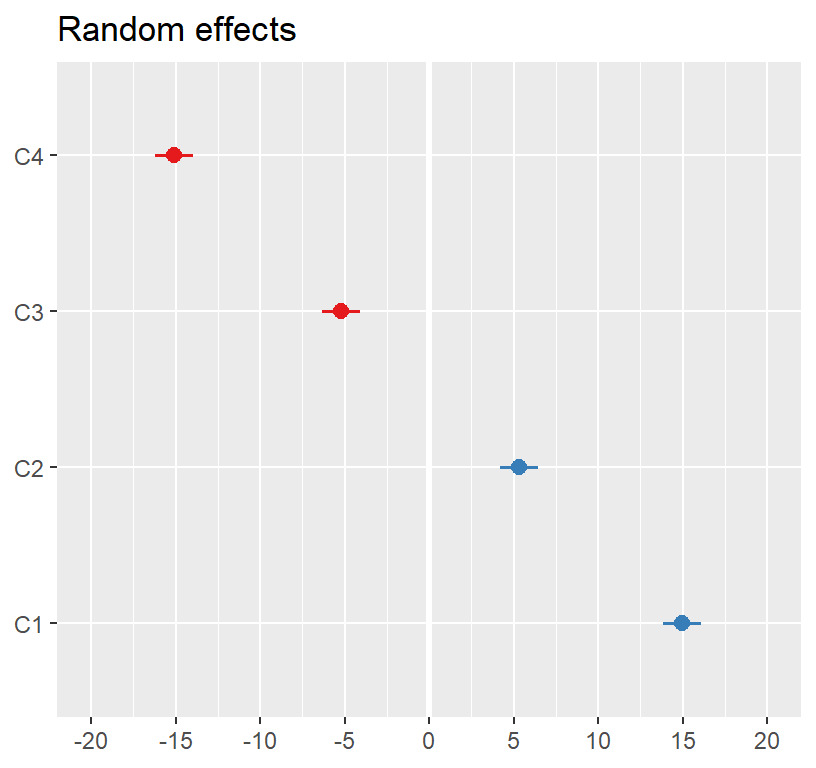
Test Model
Model.1<-lmer(Math ~ActiveTime+(1|Classroom),
                   data=Math.Data, REML=FALSE)
summary(Model.1)
## Linear mixed model fit by maximum likelihood . t-tests use Satterthwaite's
## method [lmerModLmerTest]
## Formula: Math ~ ActiveTime + (1 | Classroom)
## Data: Math.Data
##
## AIC BIC logLik deviance df.resid
## 399.3 408.8 -195.6 391.3 76
##
## Scaled residuals:
## Min 1Q Median 3Q Max
## -2.13111 -0.77650 -0.04481 0.61218 2.50097
##
## Random effects:
## Groups Name Variance Std.Dev.
## Classroom (Intercept) 200.00 14.142
## Residual 5.61 2.368
## Number of obs: 80, groups: Classroom, 4
##
## Fixed effects:
## Estimate Std. Error df t value Pr(>|t|)
## (Intercept) 58.862 7.261 4.315 8.107 0.000907 ***
## ActiveTime 11.269 3.140 77.695 3.589 0.000579 ***
## ---
## Signif. codes: 0 '***' 0.001 '**' 0.01 '*' 0.05 '.' 0.1 ' ' 1
##
## Correlation of Fixed Effects:
## (Intr)
## ActiveTime -0.224- This looks like our final lm model (but we have an intercept)
- Lets sum it up.
- Our intercept was 11.27, which was significant
- Our slope was 58.86, which was significant
- Our random effects changed (now we added fixed effects)
plot_model(Model.1, type ='re',
         facet.grid = FALSE,
         sort.est = "sort.all",
         y.offset = .4)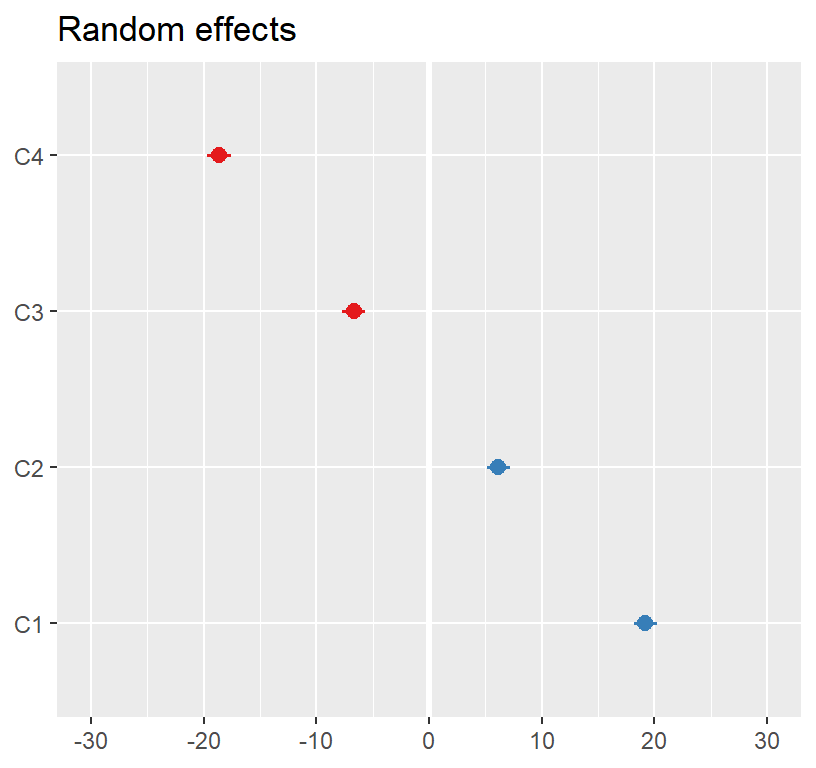
What happened to \(R^2\)?
Plot the final model and \(R^2\) problems
- I find “effects” package most accurate
library(effects)
Results.Model.1<-Effect(c("ActiveTime"),Model.1,
     xlevels=list(ActiveTime=seq(0,1,.2)))

Results.Model.1<-as.data.frame(Results.Model.1)

Final.Fixed.Plot.1 <-ggplot(data = Results.Model.1,
                            aes(x = ActiveTime, y =fit))+
  geom_line(size=2)+
  coord_cartesian(xlim = c(0, 1),ylim = c(0, 100))+
  geom_ribbon(aes(ymin=fit-se, ymax=fit+se),alpha=.2)+
  xlab("Proportion of Time Engaged in Active Learning")+
  ylab("Math Score")+
  theme(legend.position = "none")
Final.Fixed.Plot.1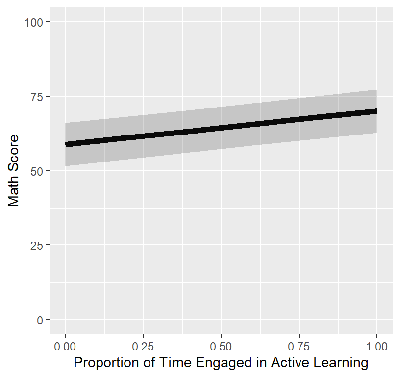
- Someone will ask you, “I want to see the real data”, meaning they want to see how the line fits the data.
- We plot the fixed effect on top of the raw data
#Fixed only, removed random effects
Math.Data$Model.1.Fitted<-predict(Model.1, re.form=NA)

ClassRoom.Plot.Bad <-ggplot(data = Math.Data)+
  coord_cartesian(xlim = c(0, 1),ylim = c(0, 100))+
  geom_point( aes(x = ActiveTime, y=Math,
                                   colour = Classroom, shape=Classroom))+
  geom_line(aes(x = ActiveTime, y=Model.1.Fitted))+
  xlab("Proportion of Time Engaged in Active Learning")+
  ylab("Math Score")+
  theme(legend.position = "top")
ClassRoom.Plot.Bad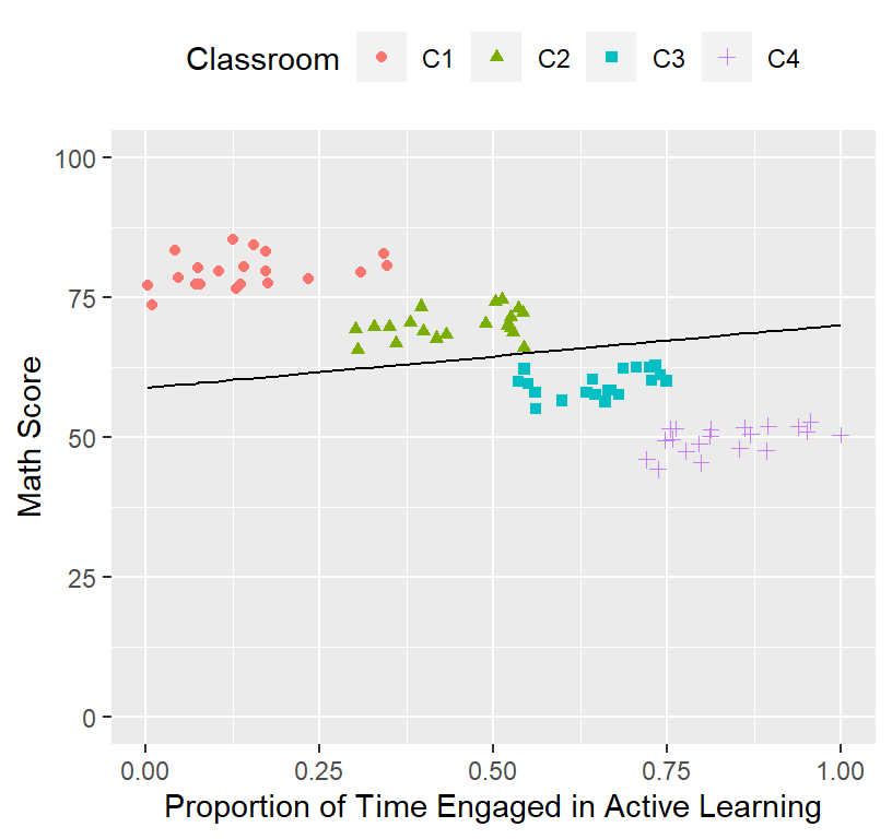
- Next, they will say, “Wow your model sucks and your \(R^2\) must be terrible. You suck as a modeler,”
- To test the \(R^2\) of the fixed effect of the final model over the raw data (meaning we IGNORE the random effects), all we have to do is run a linear regression of the fitted data fixed data to the raw data
- Nakagawa and Schielzeth (2013): function from https://github.com/jslefche/rsquared.glmm/blob/master/rsquaredglmm.R
- \(R^2_{Marginal}\) = (fixed variance / Total variance)
\[ R^2_{Marginal} = \frac{\sigma^2_{fixed}} {\sigma^2_{fixed}+\sigma^2_{random}+\sigma^2_{residual}} \]
source('RsquaredHelper.R')
rsquared.glmm(Model.1)
## Class Family Link Marginal Conditional AIC
## 1 lmerModLmerTest gaussian identity 0.04359631 0.9739071 399.2721The Marginal \(R^2\) is terrible.
Often you cannot simply add a scatterplot. However, there are ways around this (but you end up plotting every classroom)
There is a fast and dirty method (but it will not work well when you have lots of control variables)
# Fixed + Random effects
Math.Data$Model.1.Fitted.Random<-predict(Model.1)

ClassRoom.Plot.Better <-ggplot(data = Math.Data)+
  coord_cartesian(xlim = c(0, 1),ylim = c(0, 100))+
  geom_point(aes(x = ActiveTime, y=Math,
                                   colour = Classroom, shape=Classroom))+
  geom_line(aes(x = ActiveTime, y=Model.1.Fitted.Random,
                                  colour = Classroom))+
  xlab("Proportion of Time Engaged in Active Learning")+
  ylab("Math Score")+
  theme(legend.position = "top")
ClassRoom.Plot.Better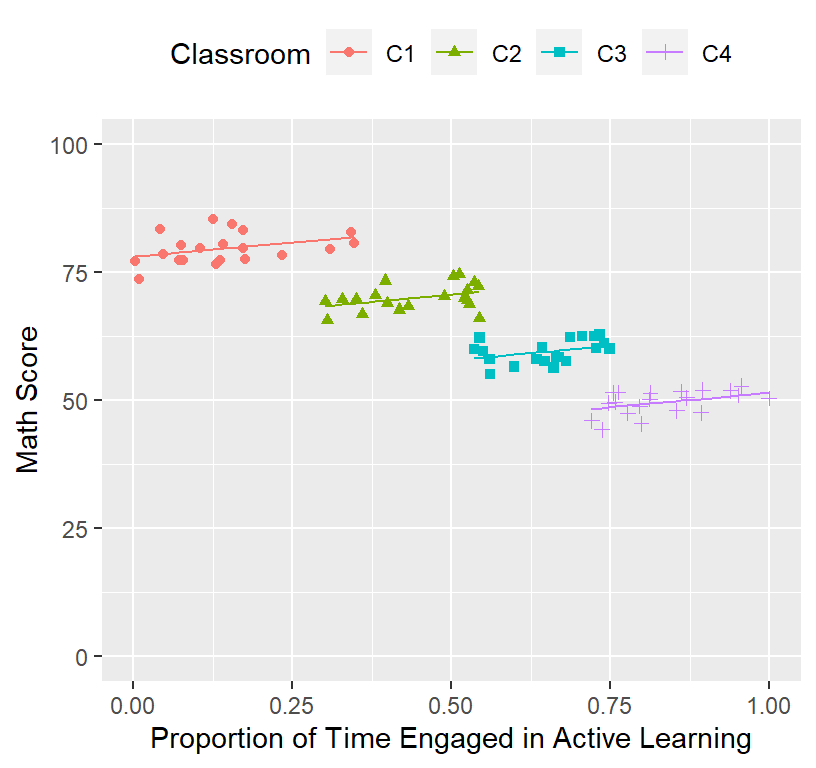
This is what the model basically fit (controling for the random effect)!
a more accurate way to graph it is show the data in its clusters
ClassRoom.Plot.Best <-ggplot(data = Math.Data, group=Classroom)+
  facet_grid(Classroom~.)+
  coord_cartesian(xlim = c(0, 1),ylim = c(0, 100))+
  geom_point(aes(x = ActiveTime, y=Math,
                                   colour = Classroom, shape=Classroom))+
  geom_line(aes(x = ActiveTime, y=Model.1.Fitted.Random,
                                  colour = Classroom))+
  xlab("Proportion of Time Engaged in Active Learning")+
  ylab("Math Score")+
  theme(legend.position = "top")
ClassRoom.Plot.Best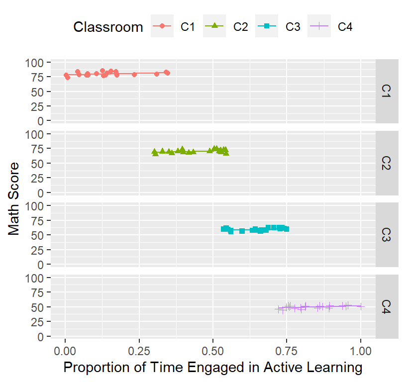
- The conditional \(R^2\) will be crazy high now (fixed variance + random variance/ Total variance)
\[ R^2_{conditional} = \frac{\sigma^2_{fixed}+\sigma^2_{random}} {\sigma^2_{fixed}+\sigma^2_{random}+\sigma^2_{residual}} \]
rsquared.glmm(Model.1)## Class Family Link Marginal Conditional AIC
## 1 lmerModLmerTest gaussian identity 0.04359631 0.9739071 399.2721\(R^2\)
- Both \(R^2\) values (fixed or fixed
+ random) dont really have any meaning in the traditional sense
- I showed you before with ICC how much of the variance was explained by the random effect
- Now I am just making it look like I fit all the data and I am the
best modeler in the world.
- In reality it is hard to really how good our fit is, so instead, we ask the question is the model with our predicts a better “fit” than our null or lower order model.
Deviance testing (-2 Log-Likelihood)
- We will cover the theory of this more next week
- For now just look at the pvalue (is model 1 better than the null model)
anova(Model.Null,Model.1)## Data: Math.Data
## Models:
## Model.Null: Math ~ 1 + (1 | Classroom)
## Model.1: Math ~ ActiveTime + (1 | Classroom)
## npar AIC BIC logLik deviance Chisq Df Pr(>Chisq)
## Model.Null 3 408.59 415.74 -201.30 402.59
## Model.1 4 399.27 408.80 -195.64 391.27 11.321 1 0.0007662 ***
## ---
## Signif. codes: 0 '***' 0.001 '**' 0.01 '*' 0.05 '.' 0.1 ' ' 1Centering
- I have not yet shown you how to center the IV correctly
- There are two approaches: Grand mean vs
Group centering
- When to center at the grand mean or the group?
- This depends on your question and the data
- When to center at the grand mean or the group?
Grand mean
- You may want to ask a grand mean question (how all people are
impacted by the predictor regardless of group), but the data may not
allow that question to be asked (if the predictor is confounded with
group)
- For example, in our example its dangerous to make predictions as
ActiveTime range is confounded with classroom!
- Remember be careful about making predictions about data you do not have
- For example, in our example its dangerous to make predictions as
ActiveTime range is confounded with classroom!
Math.Data$ActiveTime.C<-scale(Math.Data$ActiveTime, center=TRUE, scale=FALSE)
Model.1.GM<-lmer(Math ~ActiveTime.C+(1|Classroom),
                   data=Math.Data, REML=FALSE)
summary(Model.1.GM)
## Linear mixed model fit by maximum likelihood . t-tests use Satterthwaite's
## method [lmerModLmerTest]
## Formula: Math ~ ActiveTime.C + (1 | Classroom)
## Data: Math.Data
##
## AIC BIC logLik deviance df.resid
## 399.3 408.8 -195.6 391.3 76
##
## Scaled residuals:
## Min 1Q Median 3Q Max
## -2.13111 -0.77650 -0.04481 0.61218 2.50097
##
## Random effects:
## Groups Name Variance Std.Dev.
## Classroom (Intercept) 200.00 14.142
## Residual 5.61 2.368
## Number of obs: 80, groups: Classroom, 4
##
## Fixed effects:
## Estimate Std. Error df t value Pr(>|t|)
## (Intercept) 64.704 7.076 3.897 9.144 0.000896 ***
## ActiveTime.C 11.269 3.140 77.695 3.589 0.000579 ***
## ---
## Signif. codes: 0 '***' 0.001 '**' 0.01 '*' 0.05 '.' 0.1 ' ' 1
##
## Correlation of Fixed Effects:
## (Intr)
## ActiveTim.C 0.000- You will notice the slope is the same as before, but intercept changed
- The intercept is now the mean of ActiveTime = 0.5183501
- Why? See below:
Math.Data$Model.1.Fitted.Random.GM<-predict(Model.1.GM) #plots fixed Random effects

ClassRoom.Plot.Better <-ggplot()+
  coord_cartesian(xlim = c(-.5,.5),ylim = c(0, 100))+
  geom_point(data = Math.Data, aes(x = ActiveTime.C, y=Math,
                                   colour = Classroom, shape=Classroom))+
  geom_line(data = Math.Data, aes(x = ActiveTime.C, y=Model.1.Fitted.Random.GM,
                                  colour = Classroom))+
  xlab("Proportion of Time Engaged in Active Learning\n(Grand Mean Centered)")+
  ylab("Math Score")+
  theme(legend.position = "top")
ClassRoom.Plot.Better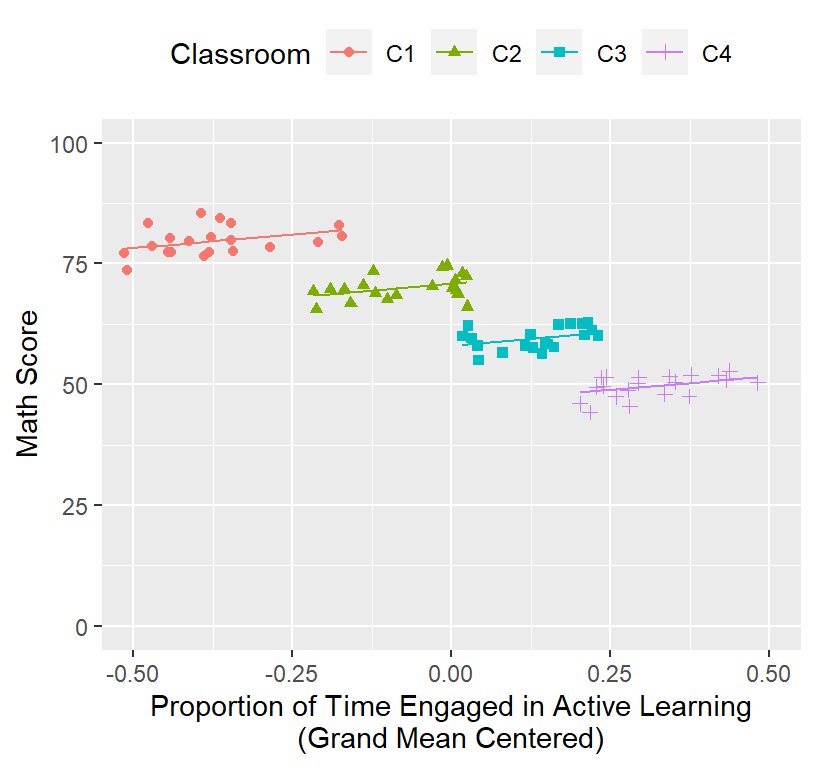
Group centering
- Group centering asks how does the within-group variation of the
predictor predicts the outcome
- This is often a very interesting question and may not always differ in story from the grand mean
- However, technically its meaning has changed!
- So, you must think about what it means for your data to have centered within group
- I how shown you how to code this already actually, reminder of code:
### Rescale IV
library(plyr)
Math.Data<-ddply(Math.Data,.(Classroom), mutate, ClassActiveTime = mean(ActiveTime))
Math.Data$ActiveTime.Class.Centered<-Math.Data$ActiveTime-Math.Data$ClassActiveTime- In this case our model will change a bit
Model.1.GC<-lmer(Math ~ActiveTime.Class.Centered+(1|Classroom),
                   data=Math.Data, REML=FALSE)
summary(Model.1.GC)
## Linear mixed model fit by maximum likelihood . t-tests use Satterthwaite's
## method [lmerModLmerTest]
## Formula: Math ~ ActiveTime.Class.Centered + (1 | Classroom)
## Data: Math.Data
##
## AIC BIC logLik deviance df.resid
## 397.4 406.9 -194.7 389.4 76
##
## Scaled residuals:
## Min 1Q Median 3Q Max
## -2.16057 -0.78325 -0.04672 0.62451 2.50992
##
## Random effects:
## Groups Name Variance Std.Dev.
## Classroom (Intercept) 126.937 11.267
## Residual 5.606 2.368
## Number of obs: 80, groups: Classroom, 4
##
## Fixed effects:
## Estimate Std. Error df t value Pr(>|t|)
## (Intercept) 64.704 5.640 4.000 11.473 0.000329 ***
## ActiveTime.Class.Centered 11.990 3.159 76.000 3.795 0.000295 ***
## ---
## Signif. codes: 0 '***' 0.001 '**' 0.01 '*' 0.05 '.' 0.1 ' ' 1
##
## Correlation of Fixed Effects:
## (Intr)
## ActvTm.Cl.C 0.000- The slope and intercept changed. Why? See below:
Math.Data$Model.1.Fitted.Random.GC<-predict(Model.1.GC) #plots fixed Random effects

ClassRoom.Plot.Better <-ggplot()+
  coord_cartesian(xlim = c(-.3,.3),ylim = c(0, 100))+
  geom_point(data = Math.Data, aes(x = ActiveTime.Class.Centered, y=Math,
                                   colour = Classroom, shape=Classroom))+
  geom_line(data = Math.Data, aes(x = ActiveTime.Class.Centered, y=Model.1.Fitted.Random.GC,
                                  colour = Classroom))+
  xlab("Proportion of Time Engaged in Active Learning\n(Centered per Classroom)")+
  ylab("Math Score")+
  theme(legend.position = "top")
ClassRoom.Plot.Better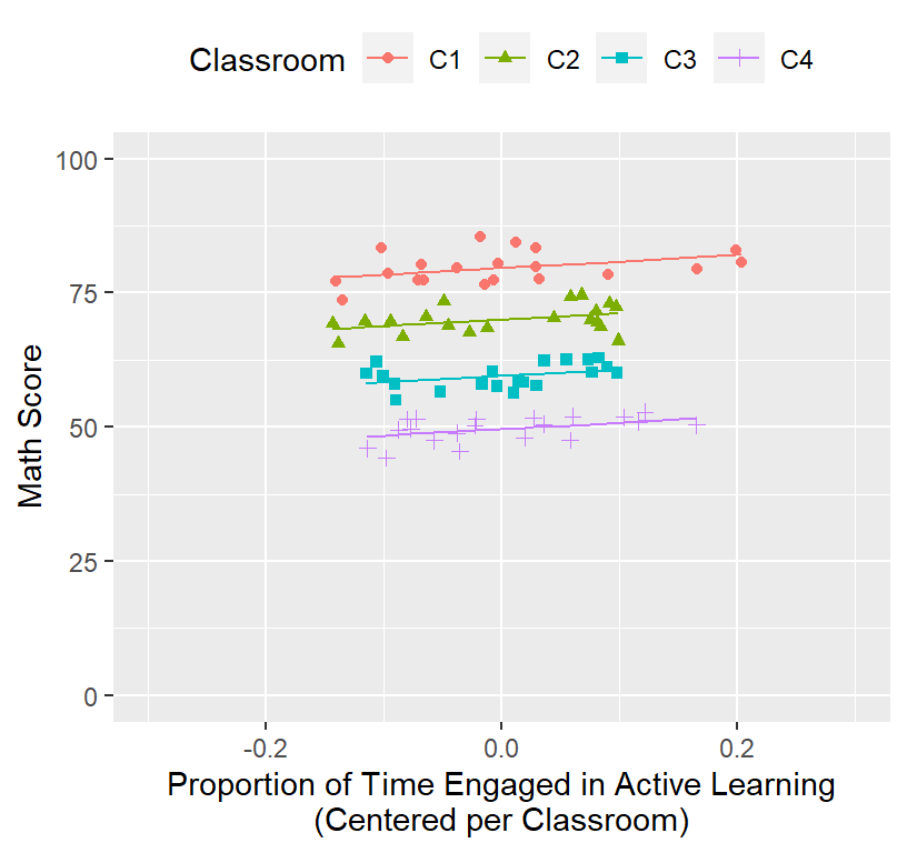
- Make sure to pay attention to the x-axis!